|
Field Level Custom Setup
Click any table (or view) in the database tree view to go to Field Setup page for the table.
Supported Field Types
General Settings
List Page
View Page
Edit Page
Add Page
Advanced Search Page
Custom field display order by drag-and-drop
1. Supported Field Types
JSPMaker supports all data types of MySQL and most commonly used data types of Oracle. The following Oracle-specific data types are not supported: BFILE, UROWID, XMLTYPE.
If JSPMaker finds an unsupported field in a table, an "Unsupported
Fields" tab will appear. You can click on the tab to view the list
of fields that are not supported.
2. General Settings

2.1 Properties Description:
| Field Name |
Field Name (read only) |
| Data Type |
Data Type (read only) |
| Size |
Maximum field length (read only) |
| Caption |
Caption to be displayed |
| Default Value |
Default value for field (for adding new record) . Must be a valid
VBScript expression. (If it is string, need to be double quoted.) |
| Primary Key |
Primary Key of the table (You should never change this field unless
you are absolutely sure that this field is unique. Otherwise unexpected
error may occur) |
3. List Page

3.1 Properties Description:
| List |
Show field in list page |
| Aggregate |
Enable Field Aggregation. Aggregated values will be shown at Page
Footer. Not applicable in multi-column view. Aggregate options include:
- TOTAL (sum of all field values in current page)
- COUNT (count of records in current page)
- AVERAGE (average field value in current page) |
| Width |
Specify field column width |
| Wrap |
Enable/Disable wrapping of field text |
| Default Order |
Order the records by this field |
4. View Page

4.1 Properties Description:
| View |
Show field in view page |
| View Tag |
View Format (refer to the following View Tag Table for details).
Used in List/View pages. |
Available View Tags (Click the [View Tag] column
or the icon on the View Tag panel toolbar to select)
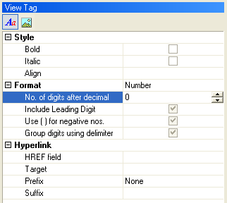
4.2 View Tag Table
| Formatted Text |
| Style |
| Bold |
Display as Bold (enclosed with <b> </b>
tags) |
| Italic |
Display as Italic (enclosed with <i> </i>
tags) |
| Align |
Left/Center/Right/Justify. Align the data (enclosed
with <div> </div> tags) |
| Format |
| None |
No formatting |
| Currency |
Display in currency format (VBScript FormatCurrency
function) |
| Date/Time |
Display in date format (JSPMaker formatdatetime
function) |
| Number |
Display in number format (VBScript FormatNumber
function) |
| Percent |
Display in percent format (VBScript FormatPercent function)
|
| String |
Format the field value with specified VBScript string function
or custom function |
| Hyperlink |
| HREF field |
Display the field as hyperlink with the href attribute set
to the value of this field. Can be the field itself. |
| Target |
_top/_parent/_self/_blank |
| Prefix |
- None (no prefix, relative path of url)
- http:// (prefix http:// added, absolute path of url)
- mailto: (prefix mailto: added, email link)
- ftp:// (prefix ftp:// added, ftp link)
- file:// (prefix file:// added, file link)
- news:// (prefix news:// added, newsgroup link) |
| Suffix |
Append the input string to the URL |
|
| Image |
Display as Image (using <img> tag). Should
be a long character string field or a field storing the path of the image
| IMG Tag attributes |
| Width |
Specify the width of the image |
| Height |
Specify the height of the image |
| Hyperlink (same
as above) |
|
5. Edit Page

5.1 Properties Description:
| Edit |
Show field add/edit page (See also the Read Only
property below) |
| Read Only |
Make the field read only in edit page. |
| Edit Tag |
Edit Format (refer to the following Edit Tag Table for details).
Use in Add/Copy/Edit/Search pages. |
Available Edit Tags (Click the [Edit Tag] column
or the icon on the Edit Tag Panel toolbar to select)
5.2 Properties Description:
| Text |
<input type="text">
tag
Attributes: Size, MaxLength |
| Password |
<input type="password">
tag
Attributes: Size, MaxLength |
| Radio |
<input type="radio">
tag
JSPMaker supports using an existing table as data source
for the options. Check "Use Table" and enter the parameters
(See the description below) Alternatively, you can enter the options
manually. |
| Checkbox |
<input type="checkbox">
tag
JSPMaker supports using an existing table as data source
for multiple checkboxes. Check "Use Table" and enter the
parameters (See the description below) Alternatively, you can enter
the options manually.
Note: The submitted values of multiple checkboxes is in CSV (comma
separated values) format. Therefore you must not use numeric fields
for multiple checkboxes. |
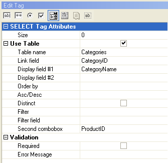
| Select |
<select> tag
Supports using an existing table as data source for the selection
list options. Check "Use Table" and enter the parameters
(See the description below) Alternatively, you can enter the options
manually.
JSPMaker also support the following <select> tag
attributes:
Size: Number of options to show. If more that 1, the
selection list is shown as a listbox, otherwise it is shown as a
combobox.
Multiple: Check to enable multiple selection.
Note: The submitted values of multiple selection is in CSV (comma
separated values) format. Therefore you must not use numeric fields
for multiple selection. |
| TextArea |
<textarea> tag
Attributes: Cols, Rows
JSPMaker supports using a DHTML editor to edit data in
memo fields and store it as HTML. Check Use DHTML Editor
to enable this feature.
Note: The DHTML Editor requires IE5.5+. It is a a freeware available
at interactivetools.com.
It is not developed by the author of JSPMaker and no technical support
will be provided. |
| File |
<input type="file"> tag
Attributes: Size (the size of the input tag, not file)
For character string fields only. Used with file uploading to folder or database.
Note: Use character string fields for file upload to FOLDER purpose. DO NOT use long character string fields or binary fields. The field is only used to store the uploaded file name.
Note: Use BLOB fields for file/image upload to DATABASE.
You can also store the information of the uploaded file in the following
fields:
| File type field |
Recommended. Useful when you want to response to user
browser the exact content type of the data. |
| File name field |
Optional. Useful if you want to use the orignal filename. |
| File size field |
Optional. Stores the uploaded file size. |
| Image width field |
Optional. For use with images only. Stores the width
of the uploaded image. |
| Image height field |
Optional. For use with images only. Stores the height
of the uploaded image. |
|
5.3 Binding data in an existing table to Edit
Tag ( Radio/Checkbox/Select)
Click Use Table and assign the following parameters:
| Table name |
The table to be linked to |
| Link field |
The field to be used as the value of an option |
| Display field #1 |
The field to be used as the label of an option |
| Display field #2 |
Optional. Another field to be included in the label of an option. |
| Order By |
Optional. Used to sort the options |
| Asc/Desc |
Optional. Sorting order. |
| Distinct |
Optional. Distinctive options |
| Filter |
WHERE clause to filter options from the table |
| Filter Field |
Optional. For used with the Dynamic Selection List feature.
Available for <select> tag only. If this <select> tag
is setup as the Second Combobox (see below), the options in this <select>
tag will be changed with the selected option of the first combobox.
It is done by filtering the linked table records by this field. Only
records with a Filter Field value matching the selected value of the
first combobox will be shown. |
| Second Combobox |
Optional. For used with the Dynamic Selection List feature.
Available for <select> tag only. Specify the other combobox
whose options are to be changed with the selected option of this
<select> tag. |
5.4 Validation (for add/copy/edit/search pages)
The data input for each field can be validated using client-side JavaScript.
| Validate |
Supported data type are:
Integer, Float, Range, Date(yyyy/mm/dd), Date(mm/dd/yyyy), Date(dd/mm/yyyy),
Time, Email, Credit card, GUID, US phone numner, US zip code, US social
security number |
| Required |
Check this checkbox if the field is mandatory |
| Error Message |
Enter the error message to popup if error occurs |
Check Use DHTML popup calendar if the field is of date type and
you want to use a visual date picker instead of manual input.
Notes:
- The popup calendar requires Internet Explorer 5 / Netscape 6 (or later)
- The popup calendar is a freeware available at Fuushikaden
Web Workshop. It is not developed by the author of JSPMaker and
no technical support will be provided.
6. Add Page

6.1 Properties Description:
| Add |
Show field in add page |
7. Advanced Search Page

7.1 Properties Description:
| Search |
Show field in Advanced Search page (Note: NOT related to Quick
Search) |
| Search Opr 1 |
Search operator #1 for the field. Used in Advanced Search. |
| Search Opr 2 |
Search operator #2 for the field. Used in Advanced Search for searching
ranges. |
8. Custom field display order by drag-and-drop
You can change the field order defined in the database by simple drag
and drop. JSPMaker will generate JSP and display records according to
this order.
|
