PHP Report Maker supports charting. It is possible to create more than one charts for each report. (Note that negative values cannot be plotted.)
After loading the database, the database objects (tables, views, custom views and reports) will be shown in the left pane (the database pane). Click on any database object to go to the Chart Setup Page for that object at any time. The Chart Setup Page is next to the Field Setup page, if the active page is Field Setup Page, click the [Chart] tab to switch to the Chart Setup Page.
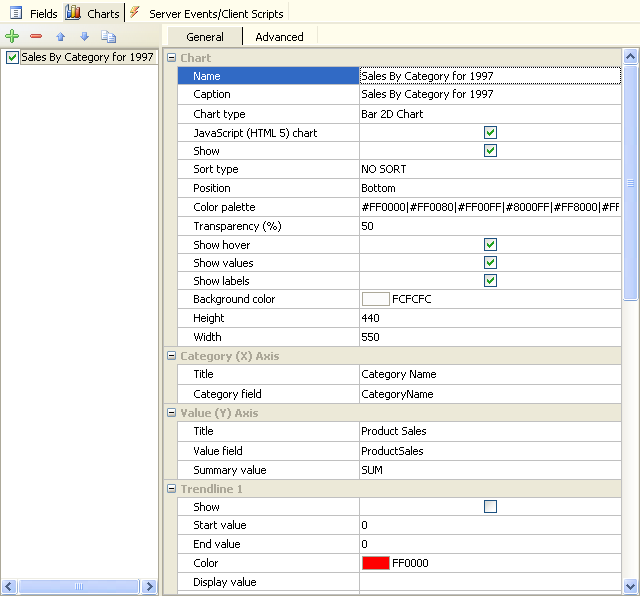
The Chart Setup pages consists of two section. The left section is a list showing all charts for the report. The right section is a panel showing various properties of the selected chart.
To setup chart properties, select a chart in the left section first, then you can modify its properties in the right panel.
You should become familiar with the charting terminology so that you'll know what to look for when you want to edit a chart. Read Chart XML API first if necessary.
| Name |
The name of the chart.
This is an internal name of the chart for referencing the chart, it is recommended that you use alphanumerical characters only for the name, also make sure the chart names for each report is unique. This is analogous to field name of a field in a database table. |
| Caption |
The caption of the chart.
This is the actual caption to be displayed on the chart and is analogous to field caption of a field in a database table. |
| Chart type |
The type of the chart. Possible values are:
- Column 2D Chart
- Column 3D Chart
- Pie 3D Chart
- Pie 2D Chart
- Line 2D Chart
- Bar 2D Chart
- Area 2D Chart
- Doughnut 2D Chart
- Candlestick
- Funnel Chart
Registered version supports the following chart types also: (Requires FusionCharts extension)
- Multi-series Column 2D Chart
- Multi-series Column 3D Chart
- Multi-series Line 2D Chart
- Multi-series Area 2D Chart
- Multi-series Bar 2D Chart
- Stacked Column 2D Chart
- Stacked Column 3D Chart
- Stacked Area 2D Chart
- Stacked Bar 2D Chart
- Multi-Series Column 2D Line Dual Y Chart
- Multi-Series Column 3D Line Dual Y Chart
- Doughnut 3D Chart
- Multi-series Bar 3D Chart
- Stacked Bar 3D Chart
- Bar 3D Chart
- Scroll Charts - Note that not all charts support scrolling, only the Column 2D, Line 2D and Area 2D charts are scrollable. To enable scrolling, go the [Advanced] tab (see below) and set numVisiblePlot to a value larger than 0.
|
| JavaScript (HTML 5) chart |
Use JavaScript chart. Note: Requires FusionCharts extension (registered version) only, not applicable to FusionCharts Free. Read Third-part Tools for more information.
FusionCharts supports JavaScript (HTML 5) charts. However, note that not all chart types supports JavaScript charts. Some chart types do not have JavaScript equivalent including Multi-series Stacked Column charts, Grid and scroll combination charts. And JavaScript charts do not support 3D rendering. All 3D charts are automatically converted to 2D when using JavaScript renderer. (Read JavaScript Charting Capabilities for detail.)
If the JavaScript chart is supported for the chart type, you can force FusionCharts to use JavaScript chart by enabling this option. If disabled, Flash chart will be used by default, and it will fall back to JavaScript chart if Flash is not supported by the browser. |
| Show |
Show or hide the chart in the report page. |
| Position |
The position of the chart in the report. Possible values are:
Default is Bottom. Note that by default the dimension of each chart is 550px(W) x 450px(H), if you put the chart on left or right of the report, the user may to need to scroll horizontally to view the chart. |
| Sort Type |
Specifies how to sort the data for charting. Possible values are:
- NO SORT - default, data not sorted
- X ASC - sort by category labels in ascending order
- X DESC - sort by category labels in descending order
- Y ASC - sort by values in ascending order
- Y DESC - sort by values in descending order
|
| Width |
Width of the total area of the chart (Width of the Flash object). Default is 550 (pixels). |
| Height |
Height of the total area of the chart (Height of the Flash object). Default is 450 (pixels). |
| Background color |
The background color of total area of the chart |
| Show labels |
Show labels on
the (usually horizontal) axis that displays the category labels for all the data series. |
| Show values |
Show values as data labels at data points to indicate the specific value or category. |
| Show hover |
Show hovering box when the user moves the mouse cursor over the data point. The hovering box shows the label and value of the data point. |
| Transparency (%) |
Transparency of the data point. 0% is transparent, 100% is opaque. |
| Color palette |
Specify colors of the data points. You can customize your own color palette by clicking [...] button and change the colors.
Note: If you use FusionCharts extension (for registered users only) and want to use its built-in palette feature, set this setting empty.
|
| Category (X) Axis |
| Title |
X-axis (category) title. Displays the category of the plotted data. |
| Category field |
The field that contains the categories of the chart |
| Value (Y) Axis |
| Title |
Y-axis (value) title. Displays a description for the scale of values against which the data is plotted. |
| Title 2 |
Secondary Y-axis (value) title 2. For use with Multi-Series Column 2D/3D Line Dual Y charts only. |
| Value field |
The field that contains the values of the chart |
| Summary Value |
Summary value of the chart, by default it is same as the summary value of the field. Supported values are:
|
| Open field |
The field that contains the "open" values of the chart. For Candlestick charts only. |
| High field |
The field that contains the "high" values of the chart. For Candlestick charts only. |
| Low field |
The field that contains the "low" values of the chart. For Candlestick charts only. |
| Close field |
The field that contains the "close" values of the chart. For Candlestick charts only. |
| Name field |
The field that contains the names of the vertical lines. Vertical lines are only drawn if the field value is not empty. For Candlestick charts only. |
| Series |
| Series type |
Specify how the series are defined. Possible values are:
- Series Field - Values for all series are from the same field. The series are defined by a field that contains the series name.
- Series Per Field - Values of each values are from different columns of the source table.
|
| Series field |
Specify the field that contains the series name when Series type is set as Series Field.
|
| Series fields |
Specify the field names of each series when Series type is set as Series Per Field. Click the [...] button to open the setup from and select the column for each series. |
| Trendline (up to 4 trendlines) |
| Show |
Show the trend line |
| Start value |
The starting y-axis value for the trendline. Say, if you want to plot a slanted trendline from value 102 to 109, the startValue would 102. |
| End value |
The ending y-axis value for the trendline. Say, if you want to plot a slanted trendline from value 102 to 109, the endValue would 109. If you do not specify a value for endValue, it would automatically assume the same value as startValue. |
| Color |
Color of the trend line and its associated text. |
| Display value |
If you want to display a string caption for the trend line by its side, you can use this attribute. Example: displayValue='Last Month High'. When you don't supply this attribute, it automatically takes the value of startValue. |
| Thickness |
Thickness of the trend line |
| Is trend zone |
Whether the trend would display a line, or a zone (filled colored rectangle). |
| Show on top |
Whether the trend line/zone would be displayed over other elements of the chart. |
| Alpha |
Alpha (transparency) of the trend line (%) |
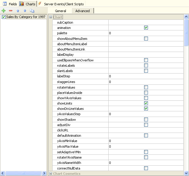
There are many other advanced chart properties for configuring the chart. Select your chart and click the [Advanced] tab to setup.