Field Setup
After loading the database, the database objects (tables, views, custom views and reports) will be shown in the left pane (the database pane). Click on any table to go to the Field Setup Page for that table at any time.
Note: For simplicity, we use "table" in the following description to refer to any of database object in the project. A database object can be either a table, a view, a custom view or a report.
ASP.NET Maker supports all commonly used ADO data type. If ASP.NET Maker finds any unsupported fields in a table, an [Unsupported Fields] tab will appear. You can click on the tab to view the list of fields that are not supported.
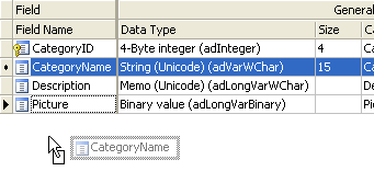
The Field Setup pages consists of two section. The upper section is a grid showing available options of all fields. The lower section contain two panels, the [Edit tag] panel and the [View tag] panel for the selected field.

The grid consists of the following sections:
General

Properties
| Field Name |
Field Name (read only) |
| Data Type |
Data Type (read only) |
| Size |
Maximum field length (read only) |
| Caption |
Caption to be displayed |
| Primary Key |
Primary Key of the table
Important Note:
- You should never change this field unless
you are absolutely sure that this field is unique. Otherwise a particular record cannot be located and unexpected results may occur.
- Composite key is supported. Primary key is uneditable in the edit page.
|
| Page No. |
Page number of the field. By default all the fields are in page 1 and multi-page is disabled.
Multi-page Add/Edit/View is supported. If you set any page number to larger than 1, multi-page feature will be enabled automatically.
You can multi-select the fields by ctrl-click or shift-click the Field Name column and then right click to set the page number for the selected fields simultaneously. Page labels are also supported, see Table Setup. |
| Auto-Update Value |
A dynamic value to update the field function automatically in Add/Edit pages.
The dropdown list for this setting is preloaded with a few functions for your selection. For example, you may want to record the last modified date of a record, then you can select "ew_CurrentDate". Do not select a function that return values of unmatching data type, for example, you should not select a function that return a non-numeric string for a numeric field.
Notes:
- This setting will make the field hidden automatically and it overrides the Default Value in Add page and Custom Value for Hidden Edit tag in Edit page. (see section below)
- You can add your own VB/C# functions, the function must accept no argument and return a value. You can add your function names (comma separated) in the Advanced Setting AutoUpdateValues. (See Tools.) For example, you can add 2 custom functions by adding ",MyAutoValueFunction1,MyAutoValueFunction2" to the existing Advanced Setting. Of course, you also need to include your VB/C# functions in the generated scripts or in the template so it is available for use. Alternatively, you can put your functions in the Global Code section under Server Events. (See Server Events and Client Scripts.)
|
Custom field display order by drag-and-drop
You can change the field order defined in the database by simple drag-and-drop. Simply ctrl-click or shift-click the Field Name column to select the field, then drag it to where you want. ASP.NET Maker will generate scripts and display records according to this order.
List Page

Properties
| List |
Show field in list page
Note: The setting is also used for Inline/Grid-Add/Edit and Master/Detail-Add Edit. |
| Export |
Include the field when export |
| Aggregate |
Enable Field Aggregation. Aggregated values will be shown at Page
Footer. Not applicable in multi-column view. Aggregate options include:
- TOTAL (sum of all field values in current page)
- COUNT (count of records in current page)
- AVERAGE (average field value in current page) |
| Width |
Specify field column width
e.g. If you enter "200px" (without quotes), the output will be style="width: 200px"
Note: If your table is too wide, browsers will try to best fit the content into screen and the specified width may be overridden. |
| Wrap |
Enable/Disable text-wrap for field value
Note: If you enable text-wrap but the field value has no allowed line-breaking points (e.g. spaces or punctuation), the text still cannot be wrapped. |
| Quick Search |
Include this field when performing Quick(Basic) Search in the List page.
Note: Only text fields and numeric fields are supported in Quick Search. By default only text fields are enabled. |
| Ext. Search |
Use this field in Extended Quick Search
Extended Quick Search is enhancement of Quick Search. If a field is checked for Ext. Search, a form element for the field will be shown in the Quick(Basic) Search form and the user input criteria for this field will be included when performing Quick(Basic) Search.
Extended Quick Search will use the same search operators specified under the "Advanced Search Page" section (see below).
|
View Page

Properties
| View |
Show field in view page |
| View Tag |
HTML tag to display the field.
Used in List/View pages. |
You can either click the [View Tag] column and select a View Tag from the drop down box
or click the icon on the View Tag panel toolbar to select. After selecting the View Tag, you can further setup its properties in the View tag panel.
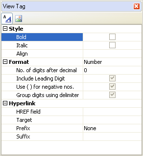
There are two types of View tag, Formatted Text and Image.
Formatted Text - View Tag to display the field value as formatted text using <div> tag with optional hyperlink. Properties:
| Format |
| None |
No formatting |
| Currency |
Display in currency format |
| Date/Time |
Display in date format
Note: The Date/Time named format indicates the date format with "/" as date separator, but the actual date separator used in the scripts is determined by the Default date format setting (see ASP.NET Settings).
|
| Number |
Display in number format |
| Percent |
Display in percent format |
| String |
Format the field value with specified string function or custom function.
Note: You can also enter your own VB/C# expression, substitute the field value by "{value}". For example, you can enter:
MyFormatStringFunction({value}) or MyFormatStringFunction({value}, MyArgs)
Of course, you must first put your function in the template or generated script or global code section under server events so it is available for use.
|
| Max Length (List page) |
Truncate the field value at specified max. length and append "..." to the end.
Note: This setting only applied to memo fields in list page and must be larger than 0 to take effect. |
| DIV Tag attributes |
| Style |
Bold - Display as Bold
Italic - Display as Italic
Align - Left/Center/Right/Justify. Align the data. |
| Custom Attributes |
Other custom attributes for the <div> tag. For example, you can enter "onmouseover='my_js_function();'".
Notes:
- The setting must be a valid VB/C# expression. If it is string, it should be double quoted.
- If you use your own JavaScript functions for the client events. You can put your JavaScript functions in the Global Code for client scripts (see Server Events and Client Scripts) so it is available for use in the generated scripts.
- Sometimes the generated code already uses some attributes (e.g. onchange), if you add the same attribute here, it may be ignored by some browsers. In such cases, use the Row_Rendered server events instead (see Server Events and Client Scripts).
|
| Hyperlink |
| HREF field |
Display the field as hyperlink with the href attribute set to the value of this field. Can be the field itself. |
| Original field value |
If the HREF field has lookup values, by default the lookup value will be used. If this option is enabled, the original field value will be used instead. |
| Target |
_top/_parent/_self/_blank |
| Prefix |
Prefix added before the HREF field value. You can enter your own partial URL (to be ended with the HREF field value) or you can select one of the follows:
- None (no prefix, relative path of URL)
- http:// (prefix http:// added, absolute path of URL)
- mailto: (prefix mailto: added, email link)
- ftp:// (prefix ftp:// added, ftp link)
- file:// (prefix file:// added, file link)
- news:// (prefix news:// added, newsgroup link) |
| Suffix |
Suffix added after the HREF field value. For example, you can enter additional URL parameter. |
| Custom Attributes |
Custom attributes for the <A> tag. For example, you can enter "rel='xxx'".
Notes:
- The setting must be a valid VB/C# expression. If it is string, it should be double quoted.
- If you use your own JavaScript functions for the client events. You can put your JavaScript functions in the Global Code for client scripts (see Server Events and Client Scripts) so it is available for use in the generated scripts.
|
| Tooltip |
| Tooltip field |
Display the field as tooltip |
| Tooltip width |
The width of the tooltip in pixels. Default is 0 (auto).
By default the width is not specified and the width will depend on the field value. However, when the tooltip field is a long text field, the width can take up the browser width, which may be unwanted. Then you can specify a value to limit the width. |
Image - View Tag to display as Image using <img> tag. The field should be a BLOB field or a field storing the path of the image.
| IMG Tag attributes |
| Width |
Specify the width of the image in pixels |
| Height |
Specify the height of the image in pixels |
| Alt |
Specify the alt attribute of the image tag
Note: If you want to use special characters, use HTML entities such as "&#euro;", or you can enter unicode caption using Unicode Property Editor, see Tools for details. |
| Custom attributes |
Other custom attributes for the <div> tag. For example, you can enter "onmouseover='my_js_function();'" (with double quotes).
Notes:
- The setting must be a valid VB/C# expression. If it is string, it should be double quoted.
- If you use your own JavaScript functions for the client events. You can put your JavaScript functions in the Global Code for client scripts (see Server Events and Client Scripts) so it is available for use in the generated scripts.
- Sometimes the generated code already uses some attributes (e.g. onchange), if you add the same attribute here, it may be ignored by some browsers. In such cases, use the Row_Rendered server events instead (see Server Events and Client Scripts).
|
| Resize |
Resize the image to above width and/or height on displaying the image.
Note: This features requires the Image Resize template extension and that the extension is enabled. (click Tools->Extension to enable) See Third-Party Tools for information about template extensions.
|
| Hyperlink (same as above) |
Edit Page

Properties
| Edit |
Show field in Edit page
Note: The setting is for Edit page only, NOT for Inline/Grid-Add/Edit and Master/Detail-Add Edit in the List page. See the List setting above. |
| Title |
Text or HTML to be used as tooltip for the field. |
| Read Only |
Make the field read only in Edit page.
Note: This setting replaces the Edit Tag by a INPUT type=hidden tag and show the field by its View Tag (see above). If you want to set the Edit Tag's readonly attribute (supported by INPUT type=text, INPUT type=password, TEXTAREA), use Row-Rendered server event. If you want to set the Edit Tag's disabled attribute, you can set <field>.Disabled property. (See Server Events and Client Script.) |
| Edit Tag |
Form element for the field.
Use in Add/Copy/Edit/Search pages. (See below for details) |
You can either click the [Edit Tag] column and select a Edit Tag from the drop down box or click the icon on the [Edit Tag] panel toolbar to select. After selecting the Edit Tag, you can further setup its properties in the Edit Tag panel:
Edit Tags
Edit Tags are HTML forms elements for the field in Add/Copy/Edit/Search pages. All HTML form elements are supported:
| Text |
 |
<input type="text">
tag
Display the field as a textbox.
Size - size of the textbox
MaxLength - maximum input length of the textbox
Custom attributes - Other custom attributes for the tag. For example, you can enter "onclick='my_js_function();'" (with double quotes).
Note: The setting must be a valid VB/C# expression. If it is string, it should be double quoted. If you use your own JavaScript functions for the client events. You can put your JavaScript functions in the Global Code for client scripts (see Server Events and Client Scripts) so it is available for use in the generated scripts.
Validation - see section below
Use Lookup Table - for use with Auto-Suggest and/or Auto-Fill feature by Ajax.
Auto-Suggest - Auto-Suggest is Text Edit Tag with a lookup table. When the user types in the textbox, a dynamic dropdown list populated with data from the lookup table matching the user input will appear for user to select. If the data already exists, the user can easily select without typing the full text. If not, the user can still input as usual. To enable this feature, check [Use Lookup Table] and enter the lookup table info in the [Lookup Table] panel next to the [Edit Tag] panel. (See section below)
Force selection - for use with Auto-Suggest and/or Auto-Fill feature by Ajax. If enabled, the user must select one of the suggested options. This must be enabled if you want to use Auto-Fill.
|
| Password |
 |
<input type="password">
tag
Display the field as a masked textbox.
Size - size of the textbox
MaxLength - maximum input length of the textbox
Custom attributes - same as above (see Text Edit Tag)
Validation - see section below |
| Radio |
 |
<input type="radio">
tag
Display the field as an option of a radio button list. You can enter the options
manually in the [User Value] panel next to the [Edit Tag] panel.
Custom attributes - same as above (see Text Edit Tag)
Use lookup table - use an existing lookup table instead of user input value/label pairs for the radio buttons. To enable this feature, check this option and enter the lookup table info in the [Lookup Table] panel next to the [Edit Tag] panel. (See section below)
Repeat columns - specifies the no. of radio buttons per row
Validation - see section below |
| Checkbox |
 |
<input type="checkbox">
tag
Display the field as one or more option(s) of a checkbox list. You can enter the options
manually in the [User Value] panel next to the [Edit Tag] panel.
Custom attributes - same as above (see Text Edit Tag)
Use lookup table - use an existing lookup table instead of user input value/label pairs for the checkboxes. To enable this feature, check this option and enter the lookup table info in the [Lookup Table] panel next to the [Edit Tag] panel. (See section below)
Repeat columns - specifies the no. of checkboxes per row
Validation - see section below
Note: The submitted values of the multi-selected checkboxes is a comma-separated string. Therefore you must use a string field
for checkbox list.
|
| Select |
 |
<select> tag
Display the field as a combobox (one selection) or a listbox (multiple selection). You can enter the options
manually in the [User Value] panel next to the [Edit Tag] panel.
Size - no. of options to show. If more that 1, the
selection list is shown as a listbox, otherwise it is shown as a
combobox.
Multiple: Check to enable multiple selection (listbox)
Note: The submitted values of the multi-selected listbox is a comma-separated string. Therefore you must use a string field
for listbox.
Custom attributes - same as above (see Text Edit Tag)
Use lookup table - use an existing lookup table instead of user input value/label pairs for the checkboxes. To enable this feature, check this option and enter the lookup table info in the [Lookup Table] panel next to the [Edit Tag] panel. (See section below)
Use Ajax - specifies if Ajax is used to update the combobox.
Note: "Use Ajax" option does not support multiple selection.
Validation - see section below |
| TextArea |
 |
<textarea> tag
Display the field as a textarea.
Cols - no. of columns of the textarea
Rows - no. of rows of the textarea
Custom attributes - same as above (see Text Edit Tag)
Use DHTML Editor - replace the textarea with a DHTML editor for editing the data as HTML.
Note: See Third-party Tools for more info on DHTML Editors.
Validation - see section below |
| File |
 |
<input type="file"> tag
Display the field as a file upload control. For BLOB fields or string fields only.
Size - size of the input tag (NOT file size)
Custom attributes - same as above (see Text Edit Tag)
If the field is of BLOB (binary) data type, file is uploaded to the database. You can also store the information of the uploaded file in the following fields:
File type field - Recommended. Useful when you want to response to user browser the exact content type of the data.
File name field - Optional. Useful if you want to use the original filename.
Note: Do not specify file name field if you want IE to open the file automatically. (IE may fail to open non-image files retrieved from database properly.) Use file name field if you want IE to popup a File Download dialog for user to save the file with the filename specified in the file name field.
File size field - Optional. Stores the uploaded file size.
Image width field - Optional. For use with images only. Stores the width of the uploaded image.
Image height field - Optional. For use with images only. Stores the height of the uploaded image.
If the field of string type, file is uploaded to a subfolder relative to the application root.
Upload folder - the folder where the uploaded file will reside. If you do not enter a specific folder, all the uploaded files will be put in the global upload folder specified in the ASP.NET tab (see ASP.NET Setup).
Notes:
- Unlike the global upload folder setting (which is a constant and must be a string without double quotes), this field specific setting must be a valid VB/C# expression. If it is a string, it must be double quoted. If you want dynamic upload folder, you can enter a valid VB/C# expression such as a function call.
- Make sure that the Web server user have read/write access to the folder. You can right-click the folder in Windows Explorer and add read/write access for ASP.NET user on the Security tab.
- The path is relative to application root. Use slashes "/" as path delimiter, starts with "~". e.g. If the application root of your website is C:\Inetpub\wwwroot\demo and you enter "~/uploads/folder1" in this textbox, the folder for the uploaded files will be C:\Inetpub\wwwroot\demo\uploads\folder1. If you are not sure which folder is application root, please read Creating Virtual Directories in IIS.
Resize image - Optionally resize the image to resize width and/or height.
Resize width - the width of the resized image
Resize height - the height of the resized image
Note: This features requires the Image Resize template extension and that the extension is enabled. (click Tools->Extension to enable) See Third-Party Tools for information about template extensions.
Validation - see section below |
| Hidden |
 |
<input type="hidden"> tag
Hide the field with a hidden form element.
Note: This is different from de-selecting the field in the [Edit] column. If a field is de-selected, no code will be generated for the field in the Edit page and the field will not be updated. With a hidden form element the field is not seen but it may still get updated.
Custom value - by default the 'value' attribute contains the field value, custom value is used to update the field with an other value, for example, "Date()", when a record is updated using the Edit page.
Notes:
- Custom value is used in Edit page only. It cannot be used with Read-only fields, User ID fields and Detail fields(Foreign key fields)
- In Add page, if a default value is specified (see section below), hidden form element will also be used but the 'value' attribute will contain the default value. If default value is not specified, the field will be displayed as a normal textbox.
Custom attributes - same as above (see Text Edit Tag) |
Using User Values for Edit Tag (Radio/Checkbox/Select)
For Radio/Checkbox/Select Edit Tags, the default option values are user input values, you can enter as many value/label pairs as you want in the [User Values] panel next to the [Edit Tag] panel.

Note: For boolean fields, if you use Radio Edit Tag with User Values, the first value/label should be for True and the second for False.
Using Lookup Table for Edit
Tag (Text/Radio/Checkbox/Select)
In real world applications, the option values usually come from a lookup table in the database. ASP.NET Maker make it very simple to use lookup values for key field values, simple click [Use Table], the [Lookup Table] panel will replace the [User Values] panel, select the following properties:
| Table name |
The lookup table to be linked to |
| Link field |
The field to be used as the value of an option (for Radio/Checkbox/Select only). This field is usually the primary key of the lookup table. |
| Display field #1 |
The field in lookup table to be used as the label of an option. (If auto suggest textbox, only string fields will be selectable.) |
| Display field #2 |
Optional. The 2nd field in lookup table to be included in the label. (If auto suggest textbox, only string fields will be selectable.) |
| Display field #3 |
Optional. The 3rd field in lookup table to be included in the label. (If auto suggest textbox, only string fields will be selectable.) |
| Display field #4 |
Optional. The 4th field in lookup table to be included in the label. (If auto suggest textbox, only string fields will be selectable.) |
| Order By |
Optional. Used to sort the options. |
| Asc/Desc |
Optional. Sorting order. |
| Distinct |
Optional. Unique records only. (for Radio/Checkbox/Select only) |
| Filter |
WHERE clause to filter options from the table. |
| Parent field |
Optional. Available for Select or Text Edit tag only. Specify the parent selection list
for current selection list or textbox. When the parent selection list is changed, the available options in current selection list or the value of the current textbox will be changed accordingly.
|
| Filter field |
Optional. Available for Select tag only. When the parent selection list changes, only
records with a Filter Field value matching the selected value of the
parent selection list will be shown.
|
| Allow add |
Optional. If enabled, the user will be allowed to add an option to the selection list.
Notes:
- Review your lookup table design before using this option. The option works best if you there is only one display field and the link field (primary key) is an autoincrement field. In that case the user only need to fill in a textbox and the option is added. But if the link field (primary key) is not an auto-increment field, the user will need to enter the link field value which the user may not know.
- The user will be asked to enter the link field and the display field(s) only. If the lookup table has other NOT NULL fields other than the link field and display field(s), the new option cannot be added. However, you can define default values for these fields in the database (not in ASP.NET Maker).
- This feature also works with child selection list in Dynamic Selection List. The filter field value also be added according to the selected option of the parent selection list.
- This feature is implemented using Ajax, newer version of browsers such as IE6+/FF1+ is required.
- Adding fields other than the link field, display fields and filter field is allowed. Click the [...] button and select additional fields in the lookup table. All required fields (fields defined as NOT NULL in the table schema without default value and field set as "Required" in the Edit Tag settings) must be included in the form. Please note that this feature is designed for adding a lookup value on-the-fly, it is NOT meant to replace the normal full-featured add form of the lookup table. You should choose as few fields as possible. File upload is not supported. Also, note that the add option form for each lookup table is shared among all fields (possibly in different tables) using the same lookup table. If you change the fields to be added to the lookup table, the shared add option form will affect other fields as well.
|
| Auto-Fill |
Optional. If enabled, the script fills the related fields for your automatically.
For example, when you select a product number (which is a lookup field using the product table as its lookup table), it will fill product price textbox for you. The required conditions are:
- the current field has a [Parent field] in the lookup table settings
- the parent field is setup as a combobox or radio buttons (That is, one selection only, or in other words, the parent field uses Select Edit tag with [Multiple] option DISABLED, see description for Select Edit tag below.)
- the parent field uses the same lookup table as the current field
If these conditions are met, when the user changes the parent combobox, the Ajax script will try to lookup another field value (specified by [Display field #1] of the lookup table for the current field) from the record found according to the selected option of the combobox, and the value will be filled into the textbox automatically.
ASP.NET Maker can setup these conditions automatically, simply click the [...] button and select the source fields for those fields to be auto-filled:

With this setup, when you select a product number from combobox, the script know the product ID from the option value, so it can use the ID to locate the product from the same lookup table (your product table) and retrieve other field values such as the product unit price and fill those fields.
Note: Before using Auto-Fill, review your database design, consider database normalization, in many cases you do not need to copy the values in the first place. You can view the other field values by creating a query/view joining the current table with the lookup table using the parent field as linked field.
|
| Allow Sort/Search |
Enable sorting and searching of the looked-up values.
Since looked-up values are field values in the lookup table (not in the main table), they are retrieved dynamically by code during execution of the script and normally the field cannot be sorted or searched by the looked-up values. ASP.NET Maker makes it possible by adding a subquery to the SQL to create a virtual field in the main table.
Limitations:
- No lookup table filter. If the lookup table has filter, the subquery becomes too complex and the SQL will not be supported by the database.
- The SQL may not work with all databases. With subqueries the SQL become more complex than usual, especially for Custom View, the SQL may not be supported by your database. (This is another reason why you should always use database query/view whenever possible, see Using Custom View.)
- Enable as few fields as possible. Since the SQL become more complex, there may be performance penalty, so do not blindly enable this feature for all lookup fields.
|
| Text input for search |
Enable text input for the field in the search panel even the Edit Tag is not "TEXT". For use with Allow sort/search.
If Allow sort/search is enabled, you may want to search with a textbox. But in some cases you may still want to se the Edit Tag (e.g. "SELECT" or "RADIO") to search. Enable this option to use text input for search. |
ASP.NET Maker supports Dynamic Selection Lists in which child lookup fields' selection list
options change dynamically based on option selected in the parent selection
list. To setup child lookup fields, click the [Child lookup fields...] button and the following setup form will be displayed:

Validation (for add/copy/edit/search pages)
The data input for each field can be validated using client-side JavaScript.
| Validate |
Supported validation formats are:
- Integer
- Float
- Range
- Date(yyyy/mm/dd) - also allows yy/mm/dd and date with time
- Date(mm/dd/yyyy) - also allows mm/dd/yy and date with time
- Date(dd/mm/yyyy) - also allows dd/mm/yy and date with time
- Time(hh:mm:ss)
- Email
- Credit card
- GUID
- US phone number
- US zip code
- US social
security number
- Regular Expression
Notes:
- The validation format indicates the date format with "/" as date separator, but the actual date separator used in the scripts is determined by the Default date format setting (see ASP.NET Settings).
- If Regular Expression, client side and server side arguments must be entered, depend on if you have enabled client-side and server-side validation (see ASP.NET Settings), see Arguments (Client-side) and Arguments (Server-side) below.
- You can add your own functions for validation. The function must accept at least one argument (the value) and return true (valid value) or false (invalid value). If your functions requires additional arguments, see Arguments (Client-side) and Arguments (Server-side) below. You can add your function names (comma separated) in the Advanced Setting CustomValidationFunctions. (See Tools.) Note that since it is both JavaScript and VB/C# function name, it must be a string that corresponds to a valid identifier for both sides. For example, you can enter "myValidateFunction1,myValidateFunction2" (no quotes). If you have enabled client side validation, you need to provide your JavaScript function. If you have enabled server-side validation, you need to provide your VB/C# function. You can put your functions in the Global Code section for server and client scripts respectively (see Server Events and Client Scripts) so they are available for use in the generated scripts.
|
| Arguments (Client-side) |
Arguments for the JavaScript functions for validation. For Regular Expression and custom validation functions only.
Note: This is JavaScript arguments, it should be comma separated (if more than one) JavaScript expressions. e.g. If it is a string, it must be single or double quoted.
If Regular Expression, arguments must be in the format of "pattern"[, RegexOptions]
- pattern
- Required. The regular expression pattern to use. Enclose the pattern in quotation marks.
- RegexOptions
- Optional. A bitwise OR combination of RegexOptions enumeration values
-
|
| Arguments (Server-side) |
Arguments for the VB/C# functions for validation. For Regular Expression and custom validation functions only.
Note: This is VB/C# arguments, it should be comma separated (if more than one) VB/C# expressions. e.g. If it is a string, it must be double quoted.
If Regular Expression, If Regular Expression, arguments must be in the format of "pattern"[, "flags"]
- pattern
- Required. The regular expression pattern to use. Enclose the pattern in quotation marks.
- flags
- Optional. Enclose flag in quotation marks. Available flags are:
-
- g (global search for all occurrences of pattern)
- i (ignore case)
- gi (both)
-
|
| Use popup calendar |
Check this option to use a visual date picker instead of manual input.
Notes:
- This option is only available for the date validation formats: Date(yyyy/mm/dd), Date(mm/dd/yyyy), Date(dd/mm/yyyy).
- The popup calendar requires IE 5+ or FF 1+. It is not developed by the author of ASP.NET Maker and no technical support will be provided. (See Third-party Tools.)
|
| Required |
Check this checkbox if the field is mandatory.
Notes:
- If the field is defined as NOT NULL in your database, the field is required even this option is not enabled.
- By default required fields will be denoted by an asterisk beside the field caption. You can change the asterisk to other or remove it in the language file.
|
| Error Message |
Enter the error message to popup if error occurs.
Note: If you want to use special characters, use HTML entities such as "&#euro;", or you can enter unicode caption using Unicode Property Editor, see Tools for details. |
| Check Duplicate |
Specify whether to check duplicated values for the field.
If the field is an unique indexed field, ASP.NET Maker will generate server side codes to check duplicate values automatically even this option is not selected. This option is useful when you want to check a non unique indexed fields for duplicated values.
|
Add Page

Properties
| Add |
Show field in Add page
Note: The setting is for Add page only, NOT for Inline/Grid-Add/Edit and Master/Detail-Add Edit in the List page. See the List setting above. |
| Default Value |
Default value for field (for adding new record only) . Must be a valid VB/C# expression. (If it is a string, must be double quoted.) |
Multi-Update Page

Properties
| Multi-Update |
Show field in Multi-Update page
Note: If a field is selected, it will be included in the Multi-Update page. In the generated Multi-Update page, there is a checkbox for each field, the field will only be updated if the checkbox is checked so users can update only the checked fields without affecting values of the other unchecked fields.
|
Advanced Search Page

Properties
| Search |
Show field in Advanced Search page (Note: NOT related to Quick
Search) |
| Search Opr 1 |
Search operator #1 for the field. Used in Advanced Search or Extended Quick Search. |
| Search Opr 2 |
Search operator #2 for the field. Used in Advanced Search or Extended Quick Search.
Notes:
- This second search operators will be useful when you may have 2 criteria for the field when searching. You can also select AND/OR to relate the 2 criteria.
- If you want to use "BETWEEN" search operator, select "BETWEEN" as the first search operator. Since "BETWEEN" requires 2 search criteria, when it is used, the second search operator will be ignored.
|
|
