Field Setup
After loading the database, the database objects (tables, views, custom views and reports) will be shown in the left pane (the database pane). Click on any database object to go to the Field Setup Page for that object at any time.
Note: PHP Report Maker does not support BLOB fields. If PHP Report Maker finds any unsupported fields in a table, an [Unsupported Fields] tab will appear. You can click on the tab to view the list of fields that are not supported.
The Field Setup pages consists of two section. The upper section is a grid showing available options of all fields. The lower section contain two panels, the [View tag] panel and the [Report Field Settings] panel for the selected field.
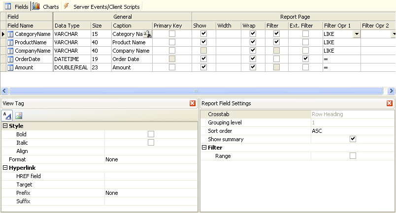
The grid consists of the following sections:
General
Properties
| Field Name |
Field Name (read only) |
| Data Type |
Data Type (read only) |
| Size |
Maximum field length (read only) |
| Caption |
Caption to be displayed |
| Primary Key |
Specify the primary key of the table. For use with showing BLOB field as image only. |
Report Page
Properties
| Show |
Show field in report page |
| Width |
Specify field column width
e.g. If you enter "200px" (without quotes), the output will be style="width: 200px" |
| Wrap |
Enable/Disable wrapping of field value |
| Filter |
Enable/Disable popup filter for the field in the report.
Normally, distinct values in the field will be populated in the popup filter. However, if the field is group-level fields, the grouping intervals will be used. If enabled, you can optionally enable "Range" for the filter. If the data type of the field is datetime, you can also optionally enable relative filters. See [Report Field Settings] below for details.
Note: Always use as few filters as possible, especially for Detail and Summary Reports that have a large number of detail records. The more filters applied, the slower the page loads.
|
| Extended Filter |
Enable/Disable extended for the field in the report.
Extended Filter is a filter to be displayed at the top of the report. By default it will be displayed as a textbox for you to enter values and search. However, it can also be displayed as a combobox and has a default value. See [Report Field Settings] below for details.
Note: Contrary to popup filters, performance of the report will be enhanced by the number of extended filters. The more extended filters applied, the faster the page loads. It is because the extended filter is done by SQL while popup filter are done by ASP.
|
| Filter Opr 1 |
First filter operator
Note: Each extended filter can use up to 2 filter operators. However, if the first filter operator is "BETWEEN", the second operator is ignored.
|
| Filter Opr 2 |
Second filter operator |
Custom field display order by drag-and-drop
You can change the field order defined in the database by simple drag-and-drop. Simply click the Field Name column to select the field, then drag it to where you want. PHP Report Maker will generate PHP and display records according to this order. (For Detail and Summary Report only)
View Tag Panel
You can click the icon on the View Tag panel toolbar to select how to display the field. After selecting the View Tag, you can further setup its properties in the View tag panel.
There are two types of View tag, Formatted Text and Image.
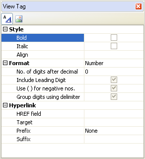
Formatted Text - View Tag to display the field value as formatted text with optional hyperlink. Properties:
| Style |
| Bold |
Display as Bold (enclosed with <b> </b> tags) |
| Italic |
Display as Italic (enclosed with <i> </i> tags) |
| Align |
Left/Center/Right/Justify. Align the data (enclosed with <div> </div> tags) |
| Format |
| None |
No formatting |
| Currency |
Display in currency format |
| Date/Time |
Display in date format |
| Number |
Display in number format |
| Percent |
Display in percent format |
| String |
Format the field value with specified PHP string function or custom function |
| Max Length (List page) |
Truncate the field value at specified max. length and append "..." to the end.
Note: This setting only applied to memo fields in list page and must be larger than 0 to take effect. |
| Replace CR+LF by <BR> |
Replace Carriage Return + Line Feed by "<br>".
Note: This setting only applied to memo fields. |
| Hyperlink |
| HREF field |
Display the field as hyperlink with the href attribute set to the value of this field. Can be the field itself. |
| Target |
_top/_parent/_self/_blank |
| Prefix |
- None (no prefix, relative path of url)
- http:// (prefix http:// added, absolute path of url)
- mailto: (prefix mailto: added, email link)
- ftp:// (prefix ftp:// added, ftp link)
- file:// (prefix file:// added, file link)
- news:// (prefix news:// added, newsgroup link) |
| Suffix |
Append the input string to the URL |
Image - View Tag to display as Image using <img> tag. The field can be a BLOB field or a field storing the file name of the image.
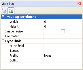
| IMG Tag attributes |
| Width |
Specify the width of the image |
| Height |
Specify the height of the image |
| Image Resize |
Specify if the image should be resized to above dimensions.
Note: This option requires Image Resize extension (for registered users). Also read Third-party Tools. |
| File Folder |
Specify the path of the image. This folder must be relative to the application root.
If not specified, the global File Folder will be used, read PHP Settings.
|
| Hyperlink (same as above) |
Report Field Settings Panel
Crosstab Report
| Crosstab |
This read-only property show the type of the field in the report, possible values are:
- Row Heading
- Column Heading
- Value
- (Not shown)
You can click the [...] button to edit the report. |
| Grouping Level |
If the field is Row Heading in the report, this read-only property show the grouping level, possible values are 1-4.
You can click the [...] button to edit the report. |
| Show Summary |
If the field is Row Heading in the report, this property sets if summary should be displayed at the end of each grouping level. |
| Summary Value |
If the field is Value field in the report, this property sets the summary value, possible values are:
|
| Grouping Interval |
If the field is Column Heading field in the report and is of date/time type, this property sets the interval for the field values, possible value are:
- Year
- Quarter
- Month
- Date
- Date/Time
|
| Year filter |
If the field is Column Heading field in the report and is of date/time type, and the Grouping Interval is Quarter or Month, this setting become available. If unchecked, quarters or months of different year in the report will be displayed together. If checked, a combobox for the available years will be added automatically to the report so user can select which year's data to display. |
Detail and Summary Report
| Detail/Summary |
This read-only property show the type of the field in the report, possible values are:
- Group-level
- Value
- (Not shown)
You can click the [...] button to edit the report. |
| Grouping Level |
If the field is group-level field in the report, this read-only property show the grouping level, possible values are 1-4.
You can click the [...] button to edit the report. |
| Show Summary |
If the field is group-level field in the report, this property sets if summary should be displayed at the end of each grouping level. |
| Grouping Interval |
If the field is group-level field in the report and is of date/time type, this property sets the interval for the field values, possible value are:
- Normal (All distinct values)
- Quarter
- Month
- Week
- Day
- Hour
- Minute
If the field is group-level field in the report and is of string type, this property sets the interval for the field values, possible value are:
- Normal (All distinct values)
- 1st Letter
- 2 Initial Letters
- 3 Initial Letters
- 4 Initial Letters
- 5 Initial Letters
If the field is group-level field in the report and is of numeric type, this property sets the interval for the field values, possible value are:
- Normal (All distinct values)
- 10s
- 50s
- 100s
- 500s
- 1000s
- 5000s
- 10000s
|
| Summary Value |
If the field is Value field in the report and is of numeric type, this property sets the summary values, possible values are:
More than one summary values are allowed. |
Filters
| Relative Days |
Add the following options in the popup filter and Extended Filter:
|
| Relative Day Periods |
Add the following options in the popup filter and Extended Filter:
- Last 30 days (
- Last 14 days
- Last 7 days
- Next 7 days
- Next 14 days
- Next 30 days
|
| Relative Weeks |
Add the following options in the popup filter and Extended Filter:
- Last two weeks
- Last week
- This week
- Next week
- Next two weeks
|
| Relative Months |
Add the following options in the popup filter and Extended Filter:
- Last month
- This month
- Next month
|
| Relative Years |
Add the following options in the popup filter and Extended Filter:
- Last year
- This year
- Next year
|
| Past / Future |
Add the following options in the popup filter and Extended Filter:
|
| Range |
Add [From] and [To] combobox in the popup filter for user to select a range of field values to filter.
Note: This option is only available for field with Filter (popup filter) enabled in above grid, NOT applicable to Extended Filter.
|
Notes:
- The optional Relative Days, Relative Day Periods, Relative Weeks, Relative Months, Relative Years, Past/Future filters are only available for datetime field with "Filter" enabled in above grid. These options are also not available when the field is set as Column Headings in Crosstab Report.
- If you enable a group of filters above but want to disable some of the filters under the group, you can unregister them using Filters_Load server event, see the example in Server Events and Client Scripts. The ID of the filter is same the filter name with capital case and no spaces, e.g. the ID for the Last two weeks filter is "LastTwoWeeks".
Extended Filters
| Use popup Calendar |
Use popup calendar for the extended filter which is displayed as textbox (for date fields only)
If the field is date field, you can enable this setting to use a popup calendar for faster date selection.
Note: If the following Display as setting is not TEXT, popup calendar is NOT applicable.
|
| Display as |
Specify how the extended filter is displayed, possible values are:
- TEXT - textbox (default)
- SELECT-ONE - combobox
- SELECT-MULTIPLE - listbox (multiple selection)
- CHECKBOX - for SET, ENUM('Y','N') and ENUM('1','0') fields
- RADIO - radio buttons
Normally the extended filter is displayed as textbox for user to input search criteria. If this setting is enabled, the extended filter will be displayed as combobox. Each option in the combobox will be a distinct value of the field in the database.
Note: The default filter operator will be "=", the Filter Opr 1 and Filter Opr 2, if specified, are overridden.
|
| Size |
Size of the <SELECT> tag. For use with SELECT-ONE or SELECT-MULTIPLE (see above) only. |
| Default value |
Default value for the extended filter
If you want to auto-select an option in the extended filter, enter a default value. Make sure the value exists among the options or it will not be found and no option in the extended filter will be selected.
Note: The default value will be directly assigned to a variable, please make sure that the input value is a valid PHP expression. If it is a string, it must be double-quoted. If it is a date, it must be double-quoted and in the format of default data formatl.
|
| Default value (for opr 2) |
Default value for the extended filter with "BETWEEN" as filter operator 1 or with filter operator 2 selected. For use with extended filter displayed as TEXT (textbox) only.
Note: The default value will be directly assigned to a variable, please make sure that the input value is a valid PHP expression. If it is a string, it must be double-quoted. If it is a date, it must be double-quoted and in the format of the default date format.
|
| Date Interval |
Display the extended filter as combobox of date interval (for date fields only)
If the field is date field, other than Display as, you can also further choose to use date interval. If this setting is enabled, Display as is overridden. The extended filter will be displayed as combobox with date intervals instead of distinct values. For example, if you select "Year", the combobox will only contain options of years, not options of distinct dates.
Possible date intervals are:
|
| Default Year |
Default year for the Date Interval combobox. Enter full year (yyyy), e.g. 2008.
Note: This setting can also be a valid PHP expression (e.g. a function) which returns the year, e.g. date('Y')
|
| Default Quarter |
Default quarter for the Date Interval combobox. Possible values are 1-4.
Note: This setting can also be a valid PHP expression (e.g. a function) which returns the quarter, e.g. ewrpt_CurrentQuarter()
|
| Default Month |
Default month for the Date Interval combobox. Possible values are 1-12.
Note: This setting can also be a valid PHP expression (e.g. a function) which returns the month, e.g. date('n')
|
| Default Day |
Default day for the Date Interval combobox. Possible values are 1-31.
Note: This setting can also be a valid PHP expression (e.g. a function) which returns the day, e.g. date('j')
|
| Validate |
Supported validation formats are:
- Integer
- Float
- Range
- Date(yyyy/mm/dd)
- Date(mm/dd/yyyy)
- Date(dd/mm/yyyy)
- Time(hh:mm:ss)
- Email
- Credit card
- GUID
- US phone number
- US zip code
- US social
security number
- Regular Expression
Notes:
- Other than "/", the date separator of the validation format can also be "-" or ".", depending on the Default date format (see PHP Setup page) or the field's Date/Time named format (see above) in the View Tag panel.
- If Regular Expression, client side and server side arguments must be entered, depend on if you have enabled client-side and server-side validation (see PHP Settings), see Arguments (Client-side) and Arguments (Server-side) below.
- You can add your own functions for validation. The function must accept at least one argument (the value) and return true (valid value) or false (invalid value). If your functions requires additional arguments, see Arguments (Client-side) and Arguments (Server-side) below. You can add your function names (comma separated) in the Advanced Setting CustomValidationFunctions. (See Tools.) Note that since it is both JavaScript and PHP function name, it must be a string that corresponds to a valid identifier for both sides. For example, you can enter "myValidateFunction1,myValidateFunction2" (no quotes). If you have enabled client side validation, you need to provide your JavaScript function. If you have enabled server-side validation, you need to provide your VBScript function. You can put your functions in the Global Code section for server and client scripts respectively (see Server Events and Client Scripts) so they are available for use in the generated scripts.
|
| Arguments (Client-side) |
Arguments for the JavaScript functions for validation. For Regular Expression and custom validation functions only.
Note: This is JavaScript arguments, it should be comma separated (if more than one) JavaScript expressions. e.g. If it is a string, it must be single or double quoted.
If Regular Expression, arguments must be in the format of "pattern"[, "flags"]
- pattern
- Required. The regular expression pattern to use. Enclose the pattern in quotation marks.
- flags
- Optional. Enclose flag in quotation marks. Available flags are:
-
- g (global search for all occurrences of pattern)
- i (ignore case)
- gi (both)
|
| Arguments (Server-side) |
Arguments for the PHP functions for validation. For Regular Expression and custom validation functions only.
Note: This is PHP arguments, it should be comma separated (if more than one) PHP expressions. e.g. If it is a string, it must be double quoted.
If Regular Expression, If Regular Expression, arguments must be the the pattern to search for, as a string.
-
-
-
|
| Use popup calendar |
Check this option to use a visual date picker instead of manual input.
Notes:
- This option is only available for the date validation formats with or without time: Date(yyyy/mm/dd), Date(mm/dd/yyyy), Date(dd/mm/yyyy).
- The popup calendar requires IE5+/FF1+. See Third-party Tools.
|
| Error Message |
Enter the error message to popup if error occurs.
Note: If you want to use special characters, use HTML entities such as "&#euro;", or you can enter unicode caption using Unicode Property Editor, see Tools for details. |
|
